Tutorial 2 Variability in activity patterns
We begin the tutorial by illustrating how site-to-site variability can affect animals’ diel activity patterns. Site-to-site variability can be decomposed into two components:
1. variability in frequency of site-use and
2. variability in timing of activity.
Here, we illustrate these two components separately in the context of a bimodal activity pattern (i.e. a pattern in which an animal’s activity is concentrated at two times of the 24-hour cycle) first, and then in the context of a unimodal activity pattern (i.e. a pattern in which an animal’s activity is concentrated at one specific time within the 24-hour cycle). Real activity patterns are likely to exhibit both sources of variability, so, in Tutorial 3, we present an example in which we simulate activity patterns by simultaneously varying both the frequency of site-use and variability in timing of activity.
We simulated data under equation 1 explained in the main text (Materials and Results in Iannarilli et al. (2024)) and reported here as:
\[ y_{it} \sim Bernoulli(p_{it}) \]
\[ \text{logit}(p_{it}) = \beta_0 + \beta_1*\text{cos}(\frac{2\pi t}{\omega_1} + (\theta_0 + \gamma_i)) + \beta_2*\text{cos}(\frac{2\pi t}{omega_1} + (\theta_1 + \gamma_i)) + \tau_i \]
\[ \tau_i \sim N(0,\sigma_\tau) \]
\[ \gamma_i \sim N(0,\sigma_\gamma) \]
We load the necessary libraries and set the intercept \(\beta_0\), and the two amplitudes \(\beta_1\) and \(\beta_2\) equal to -3, 1, and 0.7, respectively. We also assign the values 3 and 2 to the common phaseshifts terms, \(\theta_0\) and \(\theta_1\), respectively, and set \(\omega_1\) and \(\omega_2\) equal to 24 and 12, respectively.
The parameters \(\tau_i\) and \(\gamma_i\) (and their associated distributions) control the level of variability in site-use (i.e. vertical shift among the activity curves) and timing of activity (i.e. horizontal shift among activity curves), respectively. For illustrative purposes, here we assign predefined values to \(\tau_i\) and \(\gamma_i\), and vary only one of them at a time.
# Load libraries
rm(list = ls())
set.seed(129)
library(dplyr)
library(grid)
library(gridExtra)
library(ggplot2)

#Set equation parameters
wavelength = 24
b0 = -3
b1 = 1
b2 = 0.7
theta0 = 3
theta1 = 2
tau_i = gamma_i = seq(-1.5, 1.5, by = 0.5)
time <- seq(0, 23, length.out = 100)
2.1 Variability in frequency of site-use
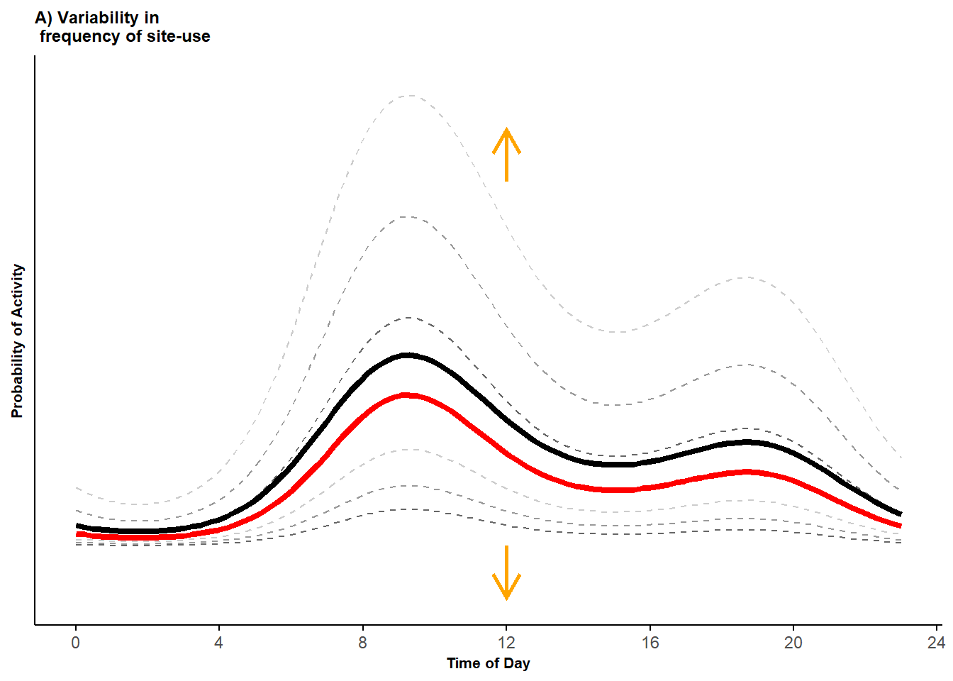
To create examples of variability in frequency of site-use, we set \(\gamma_i = 0\), keep all the other parameters constant, and vary \(\tau_i\) from -1.5 to 1.5 in increments of 0.5. We create the curves on the logit scale, based on equation 1, but then transform them back to the probability scale, for ease of interpretation.
# create the curves
p_df<-data.frame()
for(i in 1:7){
 p_df<-rbind(p_df,
   data.frame(p = plogis(b0 + b1*cos(2*pi*time/(24)+theta0 + gamma_i[4]) +
                         b2*cos(2*pi*time/(12)+ theta1 + gamma_i[4]) + tau_i[i]
                         ),
             time = time,
             curvesID = rep(as.factor(i), length(time))
             )
   )
}
p_df$curvesLeg = as.factor(rep(c("+/- 0.5 SD", "+/- 1 SD", "+/- 1.5 SD", "Conditional", "+/- 0.5 SD", "+/- 1 SD", "+/- 1.5 SD"),
                               each = length(time)
                               )
                           )
p_df$mean <- c(rep(rep("off", length(time)),3),
               rep("on", length(time)),
               rep(rep("off", length(time)),3)
               )
We can then calculate the marginal mean by integrating over the distribution of the random effects.
p_marg <- matrix(NA,length(time), 1)
for(i in 1:length(time)){
  intfun<-function(tau_x){
    plogis(b0 + b1*cos(2*pi*time[i]/(24) + theta0 + gamma_i[4]) +
           b2*cos(2*pi*time[i]/(12) + theta1 + gamma_i[4]) + tau_x
           ) * dnorm(tau_x, mean = 0, sd = 1)
  }
    p_marg[i]<-integrate(intfun,-Inf, Inf)[1]
}
We discuss differences between conditional and marginal means in detail in Tutorial 8 and in Box 1 in the main text (Iannarilli et al. 2024). Although we can consider conditional means for any site, it is often instructive to consider the conditional mean curve for a “typical site”, which is obtained by setting all the random effects equal to zero; it is this conditional mean we are referring to if we do not mention a specific site. We can plot the conditional and marginal curves using the code below:
# Combine dataframes for plotting
p_df2 <- data.frame(p = unlist(p_marg),
                    time = time,
                    mean = "on",
                    curvesID = as.factor(8),
                    curvesLeg = as.factor("Marginal")
                    )
p_df <- rbind(p_df, p_df2)
# plot activity curves
(pl_vert <- ggplot(p_df, aes(x = time, y = p, group = curvesID)) +
geom_line(aes(color = curvesLeg, linewidth = mean, linetype = mean)) +
scale_color_manual(values = c("grey40", "grey60", "grey80", "red", "black")) +
scale_linewidth_manual(values = c(0.5, 1.5)) +
scale_linetype_manual(values = c(2, 1, 2)) +
coord_cartesian(ylim = c(-0.05, 0.45)) +
labs(x = "Time of Day", y = "Probability of Activity", title = "A) Variability in \n frequency of site-use") +
theme_minimal()+
theme(legend.position = "none",
axis.line = element_line(colour = 'black', linetype = 'solid'),
axis.ticks.x = element_line(colour = 'black', linetype = 'solid'), #element_blank(), #
axis.text.y = element_blank(),
axis.title=element_text(size = 8,face = "bold"),
plot.title=element_text(size = 9,face = "bold"),
panel.grid.minor = element_blank(),
panel.grid.major = element_blank()
) +
geom_segment(aes(x=12, y=min(p), xend=12, yend=min(p)-0.05), arrow=arrow(length= unit(0.5, "cm")),
linewidth = 1, color = "orange", linejoin = "mitre") +
geom_segment(aes(x=12, y=0.35+0.003, xend=12, yend=0.35+0.053), arrow=arrow(length= unit(0.5, "cm")),
linewidth = 1, color = "orange", linejoin = "mitre")+
scale_x_continuous(breaks=seq(0,24,length.out=7), labels=seq(0,24,4))
) 
Figure 2.1: Probability activity curves across sites (dashed lines) along with the marginal mean curve (black line) and conditional mean curve (red line).
In this first plot, the dashed grey curves represent the curves generated using the different values assigned to \(\tau_i\) (darker to lighter colors from lower to higher in absolute values). All other things equal, these different values of \(\tau_i\) lead to a vertical shift in the activity curves, which corresponds to a change in the frequency of site-use. The red curve gives the conditional mean for a “typical site” (estimated by setting \(\tau_i = 0\) and \(\gamma_i = 0\) in equation 1), and the black curve gives the marginal mean.
2.2 Variability in timing of activity
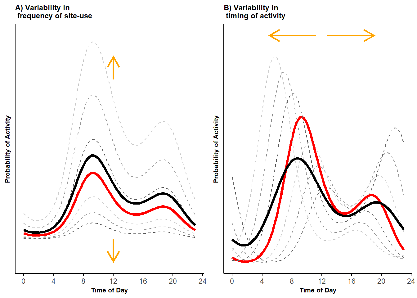
To create examples of variability in timing of activity, we set the random phaseshift \(\gamma_i\) as equal to 0, \(\pm\) 0.5, \(\pm\) 1.0, and \(\pm\) 1.5, while keeping \(\tau_i = 0\) and the remaining parameters with the same values used before. We create and plot the curves, then join the two plots to create the first portion of Figure 1, reported in the main text (Iannarilli et al. 2024).
# create the curves
p_df<-data.frame()
for(i in 1:7){
 p_df<-rbind(p_df,
             data.frame(p = plogis(b0 + b1*cos(2*pi*time/(24)+theta0 + gamma_i[i]) +
                                   b2*cos(2*pi*time/(12)+ theta1 + gamma_i[i]) + tau_i[4]
                                   ),
                        time = time,
                        curvesID = rep(as.factor(i), length(time))
                        )
            )
}
p_df$curvesLeg = as.factor(rep(c("+/- 0.5 SD", "+/- 1 SD", "+/- 1.5 SD", "Conditional", "+/- 0.5 SD", "+/- 1 SD", "+/- 1.5 SD"),
                               each = length(time)
                               )
                           )
p_df$mean <- c(rep(rep("off", length(time)),3),
               rep("on", length(time)),
               rep(rep("off", length(time)),3)
               )

# calculate the marginal mean activity curve by integrating over the distribution of the random effects
p_marg <- matrix(NA,length(time), 1)
for(i in 1:length(time)){
  intfun<-function(gamma_x){
     plogis(b0 + b1*cos(2*pi*time[i]/(24)+ theta0 + gamma_x) +
            b2*cos(2*pi*time[i]/(12)+theta1 + gamma_x) + tau_i[4]
            ) *dnorm(gamma_x, mean = 0, sd = 1)
       }
       p_marg[i]<-integrate(intfun,-Inf, Inf)[1]
}
p_df2 <- data.frame(p = unlist(p_marg),
                    time = time,
                    mean = "on",
                    curvesID = as.factor(8),
                    curvesLeg = as.factor("Marginal")
                    )
p_df <- rbind(p_df, p_df2)
# plot
pl_hor <- ggplot(p_df, aes(x = time, y = p, group = curvesID)) +
geom_line(aes(color = curvesLeg, linewidth = mean, linetype = mean)) +
scale_color_manual(values = c("grey40", "grey60", "grey80", "red", "black")) +
scale_linewidth_manual(values = c(0.5, 1.5)) +
scale_linetype_manual(values = c(2, 1)) +
labs(x = "Time of Day", y = "Probability of Activity", title = "B) Variability in \n timing of activity") +
theme_minimal()+
theme(legend.position = "none",
axis.line = element_line(colour = 'black', linetype = 'solid'),
axis.ticks.x = element_line(colour = 'black', linetype = 'solid'),
axis.text.y = element_blank(),
axis.title=element_text(size=8,face="bold"),
plot.title=element_text(size=9,face="bold"),
panel.grid.minor = element_blank(),
panel.grid.major = element_blank()
) +
geom_segment(aes(x=12 - 0.75, y=max(p) + 0.02, xend=12 - 7, yend=max(p) + 0.02), arrow=arrow(length= unit(0.5, "cm")),
linewidth = 1, color = "orange", linejoin = "mitre") +
geom_segment(aes(x=12 + 0.75, y=max(p) + 0.02, xend=12 + 7, yend=max(p) + 0.02), arrow=arrow(length= unit(0.5, "cm")),
linewidth = 1, color = "orange", linejoin = "mitre") +
scale_x_continuous(breaks=seq(0,24,length.out=7), labels=seq(0,24,4))+
guides(linetype=element_blank())
# Join plots
pl <- grid.arrange(pl_vert, pl_hor, ncol = 2)
Figure 2.2: Bimodal probability activity curves showing variability in frequency of site-use (A) and variability in timing of activity (B); displayed are activity curves across sites (dashed lines) along with the marginal mean curves (black lines) and conditional mean curves (red lines).
The dashed lines in Figure 2.2 panel B represent curves simulated using different values of \(\gamma_i\) (darker to lighter colors from lower to higher in absolute values). Varying the random phaseshift \(\gamma_i\) results in activity curves that are shifted horizontally. Because we are simulating data using two cosine terms, the cumulative effects of the two random phaseshifts (one per cosine term) also affect the intensity of site-use.
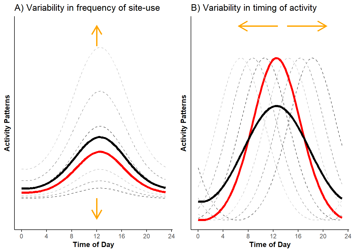
Site-to-site variability in a unimodal pattern. For completeness, we also present how variability affects a unimodal activity pattern. We can simulate this activity pattern by re-running the code above without the second cosine term, that is, by setting \(\beta_2 = 0\).
#Setup data
p_df<-data.frame()
for(i in 1:7){
 p_df<-rbind(p_df,
             data.frame(p = plogis(b0 + b1*cos(2*pi*time/(24)+theta0 + gamma_i[4]) + tau_i[i]),
                        time = time,
                        curvesID = rep(as.factor(i), length(time))
                        )
            )
}
p_df$curvesLeg = as.factor(rep(c("+/- 0.5 SD", "+/- 1 SD", "+/- 1.5 SD", "Conditional", "+/- 0.5 SD", "+/- 1 SD", "+/- 1.5 SD"),
                               each = length(time)
                               )
                           )
# change in frequency of site-use
p_df$mean <- c(rep(rep("off", length(time)),3),
               rep("on", length(time)),
               rep(rep("off", length(time)),3)
               )


# calculate the marginal mean activity curve
p_marg <- matrix(NA,length(time), 1)
for(i in 1:length(time)){
  intfun<-function(tau_x){
    plogis(b0 + b1*cos(2*pi*time[i]/(24)+ theta0 + gamma_i[4]) + tau_x
           ) *  dnorm(tau_x, mean = 0, sd = 1)
  }
    p_marg[i]<-integrate(intfun,-Inf, Inf)[1]
}
p_df2 <- data.frame(p = unlist(p_marg),
                    time = time,
                    mean = "on",
                    curvesID = as.factor(8),
                    curvesLeg = as.factor("Marginal")
                    )
p_df <- rbind(p_df, p_df2)
# plot
pl_vert_uni <- ggplot(p_df, aes(x = time, y = p, group = curvesID)) +
geom_line(aes(color = curvesLeg, linewidth = mean, linetype = mean)) +
scale_color_manual(values = c("grey40", "grey60", "grey80", "red", "black")) +
scale_linewidth_manual(values = c(0.5, 1.5)) +
scale_linetype_manual(values = c(2, 1, 2)) +
coord_cartesian(ylim = c(-0.05, max(p_df$p)+0.053)) +
labs(x = "Time of Day", y = "Activity Patterns", title = "A) Variability in frequency of site-use") +
theme_minimal()+
theme(legend.position = "none",
axis.line = element_line(colour = 'black', linetype = 'solid'),
axis.ticks.x = element_line(colour = 'black', linetype = 'solid'),
axis.text.y = element_blank(), #element_text(size=8),
axis.title=element_text(size=10,face="bold"),
panel.grid.minor = element_blank(),
panel.grid.major = element_blank()
) +
geom_segment(aes(x=12, y=min(p), xend=12, yend=min(p)-0.05), arrow=arrow(length= unit(0.5, "cm")),
linewidth = 1, color = "orange", linejoin = "mitre") +
geom_segment(aes(x=12, y=max(p)+0.003, xend=12, yend=max(p)+0.053), arrow=arrow(length= unit(0.5, "cm")),
linewidth = 1, color = "orange", linejoin = "mitre")+
scale_x_continuous(breaks=seq(0,24,length.out=7), labels=seq(0,24,4))
# change in timing of activity
# creating the curves
p_df<-data.frame()
for(i in 1:7){
p_df<-rbind(p_df,
data.frame(p = plogis(b0 + b1*cos(2*pi*time/(24)+theta0 + gamma_i[i]) + tau_i[4]),
time = time,
curvesID = rep(as.factor(i), length(time))
)
)
}
p_df$curvesLeg = as.factor(rep(c("+/- 0.5 SD", "+/- 1 SD", "+/- 1.5 SD", "Conditional", "+/- 0.5 SD", "+/- 1 SD", "+/- 1.5 SD"),
each = length(time)
)
)
p_df$mean <- c(rep(rep("off", length(time)),3), rep("on", length(time)), rep(rep("off", length(time)),3))
# calculate the marginal mean activity curve by integrating over the distribution of the random effects
p_marg <- matrix(NA,length(time), 1)
for(i in 1:length(time)){
intfun<-function(gamma_x){
plogis(b0 + b1*cos(2*pi*time[i]/(24)+ theta0 + gamma_x) +tau_i[4]
) * dnorm(gamma_x, mean = 0, sd = 1)
}
p_marg[i]<-integrate(intfun,-Inf, Inf)[1]
}
p_df2 <- data.frame(p = unlist(p_marg),
time = time,
mean = "on",
curvesID = as.factor(8),
curvesLeg = as.factor("Marginal")
)
p_df <- rbind(p_df, p_df2)
# plot
pl_hor_uni <- ggplot(p_df, aes(x = time, y = p, group = curvesID)) +
geom_line(aes(color = curvesLeg, linewidth = mean, linetype = mean)) +
scale_color_manual(values = c("grey40", "grey60", "grey80", "red", "black")) +
scale_linewidth_manual(values = c(0.5, 1.5)) +
scale_linetype_manual(values = c(2, 1)) +
labs(x = "Time of Day", y = "Activity Patterns", title = "B) Variability in timing of activity") +
theme_minimal()+
theme(legend.position = "none",
axis.line = element_line(colour = 'black', linetype = 'solid'),
axis.ticks.x = element_line(colour = 'black', linetype = 'solid'),
axis.text.y = element_blank(), #element_text(size=8),
axis.title=element_text(size=10,face="bold"),
panel.grid.minor = element_blank(),
panel.grid.major = element_blank()
) +
geom_segment(aes(x=13.5 - 0.75, y=max(p) + 0.02, xend=13.5 - 7, yend=max(p) + 0.02), arrow=arrow(length= unit(0.5, "cm")),
linewidth = 1, color = "orange", linejoin = "mitre") +
geom_segment(aes(x=13.5 + 0.75, y=max(p) + 0.02, xend=13.5 + 7, yend=max(p) + 0.02), arrow=arrow(length= unit(0.5, "cm")),
linewidth = 1, color = "orange", linejoin = "mitre") +
scale_x_continuous(breaks=seq(0,24,length.out=7), labels=seq(0,24,4)) +
guides(linetype=element_blank())
# Join plots
pl_uni <- grid.arrange(pl_vert_uni, pl_hor_uni, ncol = 2)
Figure 2.3: Unimodal probability activity curves showing variability in frequency of site-use (A) and variability in timing of activity (B); displayed are activity curves across sites (dashed lines) along with the marginal mean curves (black lines) and conditional mean curves (red lines).
This second example (Figure 2.3) clearly illustrates how varying \(\gamma_i\) (while keeping all the other parameters constant) leads to the horizontal shift of the curves, with peaks in activity equal across time but occurring at different times of the diel cycle.
In the next Tutorial, we simulate data drawing values of \(\tau_i\) and \(\gamma_i\) from the normal distributions specified at the beginning of this Tutorial. We use these simulated data to illustrate how trigonometric and cyclic cubic regression spline hierarchical models can be used to estimate activity patterns. We will further elaborate on differences between conditional and marginal mean activity patterns in Tutorial 8.